| Title: | Extra Coordinate Systems, 'Geoms', Statistical Transformations, Scales and Fonts for 'ggplot2' |
| Version: | 0.4.0 |
| Maintainer: | Bob Rudis <bob@rud.is> |
| Description: | A compendium of new geometries, coordinate systems, statistical transformations, scales and fonts for 'ggplot2', including splines, 1d and 2d densities, univariate average shifted histograms, a new map coordinate system based on the 'PROJ.4'-library along with geom_cartogram() that mimics the original functionality of geom_map(), formatters for "bytes", a stat_stepribbon() function, increased 'plotly' compatibility and the 'StateFace' open source font 'ProPublica'. Further new functionality includes lollipop charts, dumbbell charts, the ability to encircle points and coordinate-system-based text annotations. |
| License: | AGPL + file LICENSE |
| LazyData: | true |
| URL: | https://github.com/hrbrmstr/ggalt |
| BugReports: | https://github.com/hrbrmstr/ggalt/issues |
| Encoding: | UTF-8 |
| Depends: | R (≥ 3.2.0), ggplot2 (≥ 2.2.1) |
| Suggests: | testthat, gridExtra, knitr, rmarkdown, ggthemes, reshape2 |
| Imports: | utils, graphics, grDevices, dplyr, RColorBrewer, KernSmooth, proj4, scales, grid, gtable, ash, maps, MASS, extrafont, tibble, plotly (≥ 3.4.1) |
| RoxygenNote: | 6.0.0 |
| VignetteBuilder: | knitr |
| Collate: | 'annotate_textp.r' 'coord_proj.r' 'formatters.r' 'fortify.r' 'geom2plotly.r' 'geom_ash.r' 'geom_bkde.r' 'geom_bkde2d.r' 'geom_dumbbell.R' 'geom_cartogram.r' 'geom_encircle.r' 'geom_lollipop.r' 'geom_table.r' 'geom_twoway_bar.r' 'geom_xspline.r' 'geom_xspline2.r' 'stat-stepribbon.r' 'ggalt-package.r' 'grob_absolute.r' 'guide_axis.r' 'stateface.r' 'utils.r' 'zzz.r' |
| NeedsCompilation: | no |
| Packaged: | 2017-02-14 18:43:58 UTC; bob |
| Author: | Bob Rudis [aut, cre], Ben Bolker [aut, ctb] (Encircling & additional splines), Ben Marwick [ctb] (General codebase cleanup), Jan Schulz [aut, ctb] (Annotations), Rosen Matev [ctb] (Original annotate_textp implementation on stackoverflow), ProPublica [dtc] (StateFace font) |
| Repository: | CRAN |
| Date/Publication: | 2017-02-15 18:16:00 |
Extra Geoms, Stats, Coords, Scales & Fonts for 'ggplot2'
Description
A package containing additional geoms, coords, stats, scales & fonts for ggplot2 2.0+
Author(s)
Bob Rudis (@hrbrmstr)
Geom Proto
Description
Geom Proto
Geom Proto
Geom Proto
Geom Proto
Geom Proto
References
https://groups.google.com/forum/?fromgroups=#!topic/ggplot2/9cFWHaH1CPs
Geom Cartogram
Description
Geom Cartogram
Absolute grob
Description
This grob has fixed dimensions and position.
Usage
absoluteGrob(grob, width = NULL, height = NULL, xmin = NULL,
  ymin = NULL, vp = NULL)
Details
It's still experimental
Text annotations in plot coordinate system
Description
Annotates the plot with text. Compared to annotate("text",...), the
placement of the annotations is specified in plot coordinates (from 0 to 1)
instead of data coordinates.
Usage
annotate_textp(label, x, y, facets = NULL, hjust = 0, vjust = 0,
  color = "black", alpha = NA, family = theme_get()$text$family,
  size = theme_get()$text$size, fontface = 1, lineheight = 1,
  box_just = ifelse(c(x, y) < 0.5, 0, 1), margin = unit(size/2, "pt"))
Arguments
label |
text annotation to be placed on the plot |
x, y |
positions of the individual annotations, in plot coordinates (0..1) instead of data coordinates! |
facets |
facet positions of the individual annotations |
hjust, vjust |
horizontal and vertical justification of the text relative to the bounding box |
color |
alpha, family, size, fontface, lineheight font properties |
alpha, family, size, fontface, lineheight |
standard aesthetic customizations |
box_just |
placement of the bounding box for the text relative to x,y coordinates. Per default, the box is placed to the center of the plot. Be aware that parts of the box which are outside of the visible region of the plot will not be shown. |
margin |
margins of the bounding box |
Examples
p <- ggplot(mtcars, aes(x = wt, y = mpg)) + geom_point()
p <- p + geom_smooth(method = "lm", se = FALSE)
p + annotate_textp(x = 0.9, y = 0.35, label="A relative linear\nrelationship", hjust=1, color="red")
Bytes formatter: convert to byte measurement and display symbol.
Description
Bytes formatter: convert to byte measurement and display symbol.
Usage
byte_format(symbol = "auto", units = "binary")

Kb(x)

Mb(x)

Gb(x)

bytes(x, symbol = "auto", units = c("binary", "si"))
Arguments
symbol |
byte symbol to use. If " |
units |
which unit base to use, " |
x |
a numeric vector to format |
Value
a function with three parameters, x, a numeric vector that
returns a character vector, symbol the byte symbol (e.g. "Kb")
desired and the measurement units (traditional binary or
si for ISI metric units).
References
Units of Information (Wikipedia) : http://en.wikipedia.org/wiki/Units_of_information
Examples
byte_format()(sample(3000000000, 10))
bytes(sample(3000000000, 10))
Kb(sample(3000000000, 10))
Mb(sample(3000000000, 10))
Gb(sample(3000000000, 10))
Similar to coord_map but uses the PROJ.4 library/package for projection
transformation
Description
The representation of a portion of the earth, which is approximately
spherical, onto a flat 2D plane requires a projection. This is what
coord_proj does, using the proj4::project() function from
the proj4 package.
Usage
coord_proj(proj = NULL, inverse = FALSE, degrees = TRUE,
  ellps.default = "sphere", xlim = NULL, ylim = NULL)
Arguments
proj |
projection definition. If left |
inverse |
if |
degrees |
if |
ellps.default |
default ellipsoid that will be added if no datum or
ellipsoid parameter is specified in proj. Older versions of PROJ.4
didn't require a datum (and used sphere by default), but 4.5.0 and
higher always require a datum or an ellipsoid. Set to |
xlim |
manually specify x limits (in degrees of longitude) |
ylim |
manually specify y limits (in degrees of latitude) |
Details
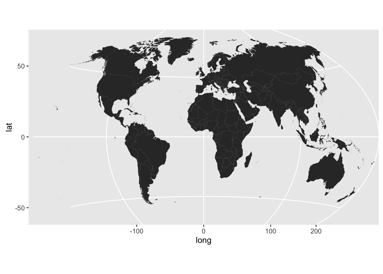
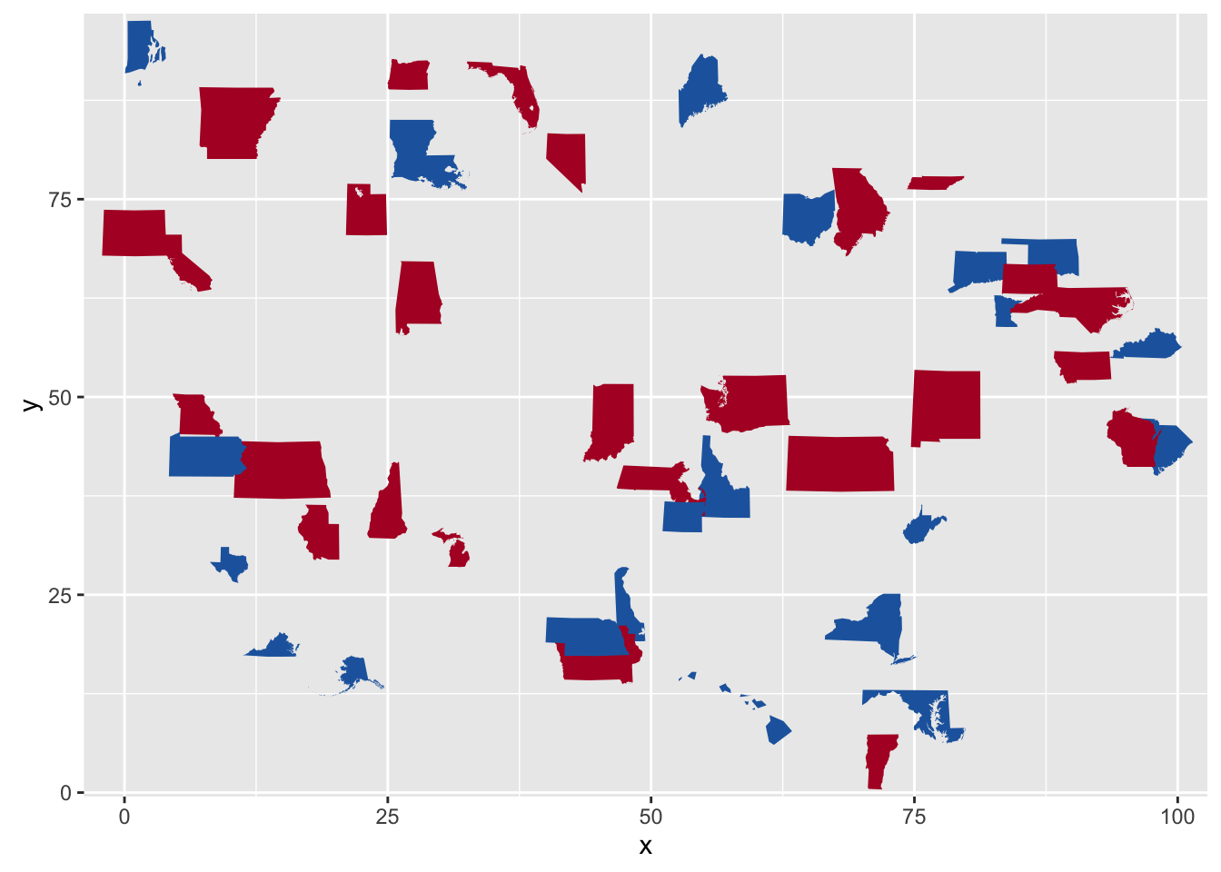
A sample of the output from coord_proj() using the Winkel-Tripel projection:
Note
It is recommended that you use geom_cartogram with this coordinate system
When inverse is FALSE coord_proj makes a fairly
large assumption that the coordinates being transformed are within
-180:180 (longitude) and -90:90 (latitude). As such, it truncates
all longitude & latitude input to fit within these ranges. More updates
to this new coord_ are planned.
Examples
## Not run:
# World in Winkel-Tripel

# U.S.A. Albers-style
usa <- world[world$region == "USA",]
usa <- usa[!(usa$subregion %in% c("Alaska", "Hawaii")),]

gg <- ggplot()
gg <- gg + geom_cartogram(data=usa, map=usa,
                    aes(x=long, y=lat, map_id=region))
gg <- gg + coord_proj(
             paste0("+proj=aea +lat_1=29.5 +lat_2=45.5 +lat_0=37.5 +lon_0=-96",
                    " +x_0=0 +y_0=0 +ellps=GRS80 +datum=NAD83 +units=m +no_defs"))
gg

# Showcase Greenland (properly)
greenland <- world[world$region == "Greenland",]

gg <- ggplot()
gg <- gg + geom_cartogram(data=greenland, map=greenland,
                    aes(x=long, y=lat, map_id=region))
gg <- gg + coord_proj(
             paste0("+proj=stere +lat_0=90 +lat_ts=70 +lon_0=-45 +k=1 +x_0=0",
                    " +y_0=0 +ellps=WGS84 +datum=WGS84 +units=m +no_defs"))
gg

## End(Not run)
Fortify contingency tables
Description
Fortify contingency tables
Usage
## S3 method for class 'table'
fortify(model, data, ...)
Arguments
model |
the contingency table |
data |
data (unused) |
... |
(unused) |
Display a smooth density estimate.
Description
A kernel density estimate, useful for displaying the distribution of variables with underlying smoothness.
Usage
geom_bkde(mapping = NULL, data = NULL, stat = "bkde",
  position = "identity", bandwidth = NULL, range.x = NULL,
  na.rm = FALSE, show.legend = NA, inherit.aes = TRUE, ...)

stat_bkde(mapping = NULL, data = NULL, geom = "area",
  position = "stack", kernel = "normal", canonical = FALSE,
  bandwidth = NULL, gridsize = 410, range.x = NULL, truncate = TRUE,
  na.rm = FALSE, show.legend = NA, inherit.aes = TRUE, ...)
Arguments
mapping |
Set of aesthetic mappings created by |
data |
The data to be displayed in this layer. There are three options: If A A |
position |
Position adjustment, either as a string, or the result of a call to a position adjustment function. |
bandwidth |
the kernel bandwidth smoothing parameter. see
|
range.x |
vector containing the minimum and maximum values of x at which
to compute the estimate. see |
na.rm |
If |
show.legend |
logical. Should this layer be included in the legends?
|
inherit.aes |
If |
... |
other arguments passed on to |
geom, stat |
Use to override the default connection between
|
kernel |
character string which determines the smoothing kernel. see
|
canonical |
logical flag: if TRUE, canonically scaled kernels are used.
see |
gridsize |
the number of equally spaced points at which to estimate the
density. see |
truncate |
logical flag: if TRUE, data with x values outside the range
specified by range.x are ignored. see |
Details
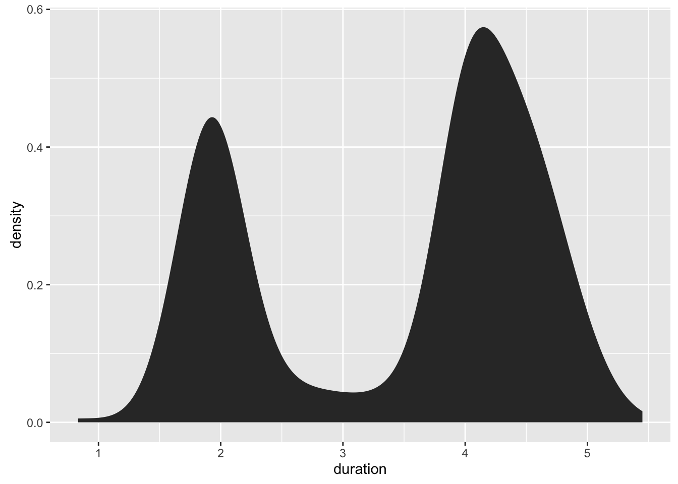
A sample of the output from geom_bkde():
Aesthetics
geom_bkde understands the following aesthetics (required aesthetics
are in bold):
-
x -
y -
alpha -
color -
fill -
linetype -
size
Computed variables
- density
density estimate
- count
density * number of points - useful for stacked density plots
- scaled
density estimate, scaled to maximum of 1
See Also
See geom_histogram, geom_freqpoly for
other methods of displaying continuous distribution.
See geom_violin for a compact density display.
Examples
data(geyser, package="MASS")

ggplot(geyser, aes(x=duration)) +
  stat_bkde(alpha=1/2)

ggplot(geyser, aes(x=duration)) +
  geom_bkde(alpha=1/2)

ggplot(geyser, aes(x=duration)) +
 stat_bkde(bandwidth=0.25)

ggplot(geyser, aes(x=duration)) +
  geom_bkde(bandwidth=0.25)
Contours from a 2d density estimate.
Description
Contours from a 2d density estimate.
Perform a 2D kernel density estimation using bkde2D and display the
results with contours. This can be useful for dealing with overplotting
Usage
geom_bkde2d(mapping = NULL, data = NULL, stat = "bkde2d",
  position = "identity", bandwidth = NULL, range.x = NULL,
  lineend = "butt", contour = TRUE, linejoin = "round", linemitre = 1,
  na.rm = FALSE, show.legend = NA, inherit.aes = TRUE, ...)

stat_bkde2d(mapping = NULL, data = NULL, geom = "density2d",
  position = "identity", contour = TRUE, bandwidth = NULL,
  grid_size = c(51, 51), range.x = NULL, truncate = TRUE, na.rm = FALSE,
  show.legend = NA, inherit.aes = TRUE, ...)
Arguments
mapping |
Set of aesthetic mappings created by |
data |
The data to be displayed in this layer. There are three options: If A A |
stat |
The statistical transformation to use on the data for this layer, as a string. |
position |
Position adjustment, either as a string, or the result of a call to a position adjustment function. |
bandwidth |
the kernel bandwidth smoothing parameter. see
|
range.x |
a list containing two vectors, where each vector contains the
minimum and maximum values of x at which to compute the estimate for
each direction. see |
lineend |
Line end style (round, butt, square) |
contour |
If |
linejoin |
Line join style (round, mitre, bevel) |
linemitre |
Line mitre limit (number greater than 1) |
na.rm |
If |
show.legend |
logical. Should this layer be included in the legends?
|
inherit.aes |
If |
... |
other arguments passed on to |
geom |
default geom to use with this stat |
grid_size |
vector containing the number of equally spaced points in each
direction over which the density is to be estimated. see
|
truncate |
logical flag: if TRUE, data with x values outside the range
specified by range.x are ignored. see |
Details
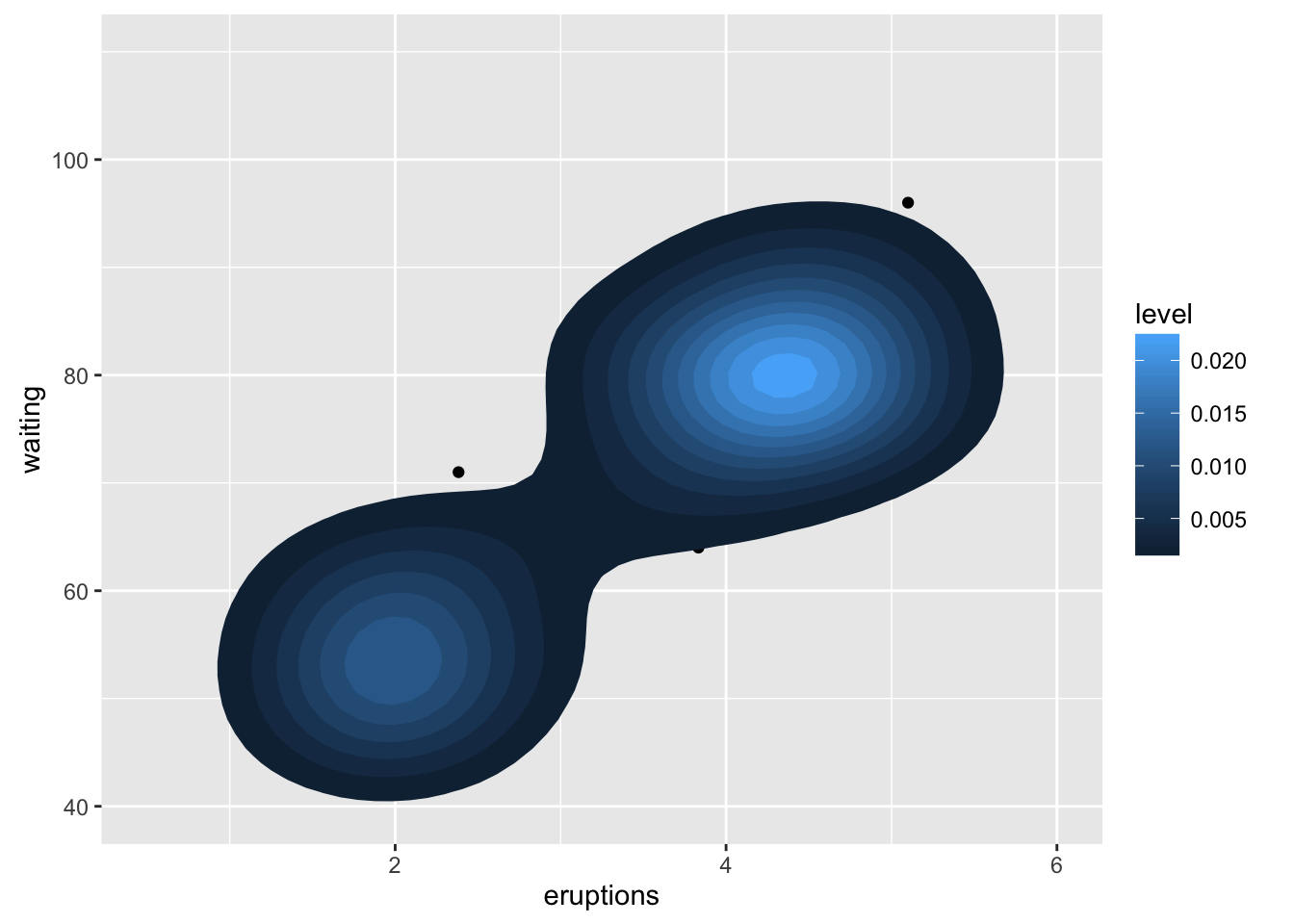
A sample of the output from geom_bkde2d():
Computed variables
Same as stat_contour
See Also
geom_contour for contour drawing geom,
stat_sum for another way of dealing with overplotting
Examples
m <- ggplot(faithful, aes(x = eruptions, y = waiting)) +
       geom_point() +
       xlim(0.5, 6) +
       ylim(40, 110)

m + geom_bkde2d(bandwidth=c(0.5, 4))

m + stat_bkde2d(bandwidth=c(0.5, 4), aes(fill = ..level..), geom = "polygon")

# If you map an aesthetic to a categorical variable, you will get a
# set of contours for each value of that variable
set.seed(4393)
dsmall <- diamonds[sample(nrow(diamonds), 1000), ]
d <- ggplot(dsmall, aes(x, y)) +
       geom_bkde2d(bandwidth=c(0.5, 0.5), aes(colour = cut))
d

# If we turn contouring off, we can use use geoms like tiles:
d + stat_bkde2d(bandwidth=c(0.5, 0.5), geom = "raster",
                aes(fill = ..density..), contour = FALSE)

# Or points:
d + stat_bkde2d(bandwidth=c(0.5, 0.5), geom = "point",
                aes(size = ..density..),  contour = FALSE)
Map polygons layer enabling the display of show statistical information
Description
This replicates the old behaviour of geom_map(), enabling specifying of
x and y aesthetics.
Usage
geom_cartogram(mapping = NULL, data = NULL, stat = "identity", ..., map,
  na.rm = FALSE, show.legend = NA, inherit.aes = TRUE)
Arguments
mapping |
Set of aesthetic mappings created by |
data |
The data to be displayed in this layer. There are three options: If A A |
stat |
The statistical transformation to use on the data for this layer, as a string. |
... |
other arguments passed on to |
map |
Data frame that contains the map coordinates. This will
typically be created using |
na.rm |
If |
show.legend |
logical. Should this layer be included in the legends?
|
inherit.aes |
If |
Aesthetics
geom_cartogram understands the following aesthetics (required aesthetics are in bold):
-
map_id -
alpha -
colour -
fill -
group -
linetype -
size -
x -
y
Examples
## Not run:
# When using geom_polygon, you will typically need two data frames:
# one contains the coordinates of each polygon (positions),  and the
# other the values associated with each polygon (values).  An id
# variable links the two together

ids <- factor(c("1.1", "2.1", "1.2", "2.2", "1.3", "2.3"))

values <- data.frame(
  id = ids,
  value = c(3, 3.1, 3.1, 3.2, 3.15, 3.5)
)

positions <- data.frame(
  id = rep(ids, each = 4),
  x = c(2, 1, 1.1, 2.2, 1, 0, 0.3, 1.1, 2.2, 1.1, 1.2, 2.5, 1.1, 0.3,
  0.5, 1.2, 2.5, 1.2, 1.3, 2.7, 1.2, 0.5, 0.6, 1.3),
  y = c(-0.5, 0, 1, 0.5, 0, 0.5, 1.5, 1, 0.5, 1, 2.1, 1.7, 1, 1.5,
  2.2, 2.1, 1.7, 2.1, 3.2, 2.8, 2.1, 2.2, 3.3, 3.2)
)

ggplot() +
  geom_cartogram(aes(x, y, map_id = id), map = positions, data=positions)

ggplot() +
  geom_cartogram(aes(x, y, map_id = id), map = positions, data=positions) +
  geom_cartogram(data=values, map=positions, aes(fill = value, map_id=id))

ggplot() +
  geom_cartogram(aes(x, y, map_id = id), map = positions, data=positions) +
  geom_cartogram(data=values, map=positions, aes(fill = value, map_id=id)) +
  ylim(0, 3)

# Better example
crimes <- data.frame(state = tolower(rownames(USArrests)), USArrests)
crimesm <- reshape2::melt(crimes, id = 1)

if (require(maps)) {

  states_map <- map_data("state")

  ggplot() +
    geom_cartogram(aes(long, lat, map_id = region), map = states_map, data=states_map) +
    geom_cartogram(aes(fill = Murder, map_id = state), map=states_map, data=crimes)

  last_plot() + coord_map("polyconic")

  ggplot() +
    geom_cartogram(aes(long, lat, map_id=region), map = states_map, data=states_map) +
    geom_cartogram(aes(fill = value, map_id=state), map = states_map, data=crimesm) +
    coord_map("polyconic") +
    facet_wrap( ~ variable)
}

## End(Not run)
Dumbell charts
Description
The dumbbell geom is used to create dumbbell charts.
Usage
geom_dumbbell(mapping = NULL, data = NULL, ..., colour_x = NULL,
  size_x = NULL, colour_xend = NULL, size_xend = NULL,
  dot_guide = FALSE, dot_guide_size = NULL, dot_guide_colour = NULL,
  na.rm = FALSE, show.legend = NA, inherit.aes = TRUE)
Arguments
mapping |
Set of aesthetic mappings created by |
data |
The data to be displayed in this layer. There are three options: If A A |
... |
other arguments passed on to |
colour_x |
the colour of the start point |
size_x |
the size of the start point |
colour_xend |
the colour of the end point |
size_xend |
the size of the end point |
dot_guide |
if |
dot_guide_size, dot_guide_colour |
singe-value aesthetics for |
na.rm |
If |
show.legend |
logical. Should this layer be included in the legends?
|
inherit.aes |
If |
Details
Dumbbell dot plots — dot plots with two or more series of data — are an alternative to the clustered bar chart or slope graph.
Aesthetics
geom_segment understands the following aesthetics (required aesthetics are in bold):
-
x -
y -
xend -
yend -
alpha -
colour -
group -
linetype -
size
Examples
library(ggplot2)

df <- data.frame(trt=LETTERS[1:5], l=c(20, 40, 10, 30, 50), r=c(70, 50, 30, 60, 80))

ggplot(df, aes(y=trt, x=l, xend=r)) +
  geom_dumbbell(size=3, color="#e3e2e1",
                colour_x = "#5b8124", colour_xend = "#bad744",
                dot_guide=TRUE, dot_guide_size=0.25) +
  labs(x=NULL, y=NULL, title="ggplot2 geom_dumbbell with dot guide") +
  theme_minimal() +
  theme(panel.grid.major.x=element_line(size=0.05))
Automatically enclose points in a polygon
Description
Automatically enclose points in a polygon
Usage
geom_encircle(mapping = NULL, data = NULL, stat = "identity",
  position = "identity", na.rm = FALSE, show.legend = NA,
  inherit.aes = TRUE, ...)
Arguments
mapping |
mapping |
data |
data |
stat |
stat |
position |
position |
na.rm |
na.rm |
show.legend |
show.legend |
inherit.aes |
inherit.aes |
... |
dots |
Details
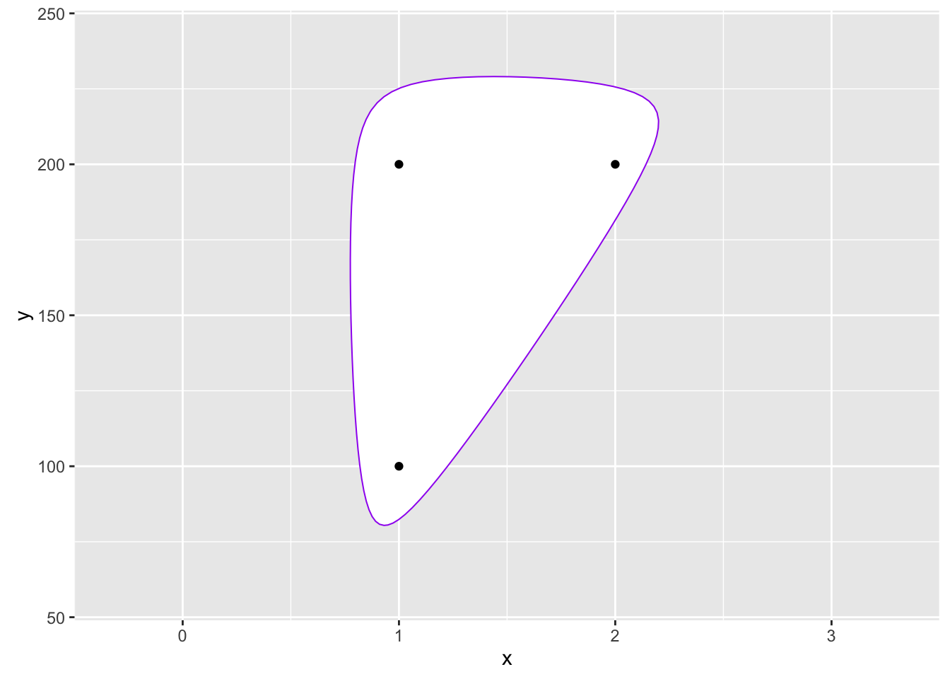
A sample of the output from geom_encircle():
Value
adds a circle around the specified points
Author(s)
Ben Bolker
Examples
d <- data.frame(x=c(1,1,2),y=c(1,2,2)*100)

gg <- ggplot(d,aes(x,y))
gg <- gg + scale_x_continuous(expand=c(0.5,1))
gg <- gg + scale_y_continuous(expand=c(0.5,1))

gg + geom_encircle(s_shape=1, expand=0) + geom_point()

gg + geom_encircle(s_shape=1, expand=0.1, colour="red") + geom_point()

gg + geom_encircle(s_shape=0.5, expand=0.1, colour="purple") + geom_point()

gg + geom_encircle(data=subset(d, x==1), colour="blue", spread=0.02) +
  geom_point()

gg +geom_encircle(data=subset(d, x==2), colour="cyan", spread=0.04) +
  geom_point()

gg <- ggplot(mpg, aes(displ, hwy))
gg + geom_encircle(data=subset(mpg, hwy>40)) + geom_point()
gg + geom_encircle(aes(group=manufacturer)) + geom_point()
gg + geom_encircle(aes(group=manufacturer,fill=manufacturer),alpha=0.4)+
       geom_point()
gg + geom_encircle(aes(group=manufacturer,colour=manufacturer))+
       geom_point()

ss <- subset(mpg,hwy>31 & displ<2)

gg + geom_encircle(data=ss, colour="blue", s_shape=0.9, expand=0.07) +
  geom_point() + geom_point(data=ss, colour="blue")
Lollipop charts
Description
The lollipop geom is used to create lollipop charts.
Usage
geom_lollipop(mapping = NULL, data = NULL, ..., horizontal = FALSE,
  point.colour = NULL, point.size = NULL, na.rm = FALSE,
  show.legend = NA, inherit.aes = TRUE)
Arguments
mapping |
Set of aesthetic mappings created by |
data |
The data to be displayed in this layer. There are three options: If A A |
... |
other arguments passed on to |
horizontal |
|
point.colour |
the colour of the point |
point.size |
the size of the point |
na.rm |
If |
show.legend |
logical. Should this layer be included in the legends?
|
inherit.aes |
If |
Details
Lollipop charts are the creation of Andy Cotgreave going back to 2011. They are a combination of a thin segment, starting at with a dot at the top and are a suitable alternative to or replacement for bar charts.
Use the horizontal parameter to abate the need for coord_flip()
(see the Arguments section for details).
A sample of the output from geom_lollipop():

Aesthetics
geom_point understands the following aesthetics (required aesthetics are in bold):
-
x -
y -
alpha -
colour -
fill -
group -
shape -
size -
stroke
Examples
df <- data.frame(trt=LETTERS[1:10],
                 value=seq(100, 10, by=-10))

ggplot(df, aes(trt, value)) + geom_lollipop()

ggplot(df, aes(value, trt)) + geom_lollipop(horizontal=TRUE)
Use ProPublica's StateFace font in ggplot2 plots
Description
The label parameter can be either a 2-letter state abbreviation
or a full state name. geom_stateface() will take care of the
translation to StateFace font glyph characters.
Usage
geom_stateface(mapping = NULL, data = NULL, stat = "identity",
  position = "identity", ..., parse = FALSE, nudge_x = 0, nudge_y = 0,
  check_overlap = FALSE, na.rm = FALSE, show.legend = NA,
  inherit.aes = TRUE)
Arguments
mapping |
Set of aesthetic mappings created by |
data |
The data to be displayed in this layer. There are three options: If A A |
stat |
The statistical transformation to use on the data for this layer, as a string. |
position |
Position adjustment, either as a string, or the result of a call to a position adjustment function. |
... |
other arguments passed on to |
parse |
If TRUE, the labels will be parsed into expressions and displayed as described in ?plotmath |
nudge_x, nudge_y |
Horizontal and vertical adjustment to nudge l abels by. Useful for offsetting text from points, particularly on discrete scales. |
check_overlap |
If |
na.rm |
If |
show.legend |
logical. Should this layer be included in the legends?
|
inherit.aes |
If |
Details
The package will also take care of loading the StateFace font for PDF and other devices, but to use it with the on-screen ggplot2 device, you'll need to install the font on your system.
ggalt ships with a copy of the StateFace TTF font. You can
run show_stateface() to get the filesystem location and then
load the font manually from there.
A sample of the output from geom_stateface():
See Also
Other StateFace operations: load_stateface,
show_stateface
Examples
## Not run:
library(ggplot2)
library(ggalt)

# Run show_stateface() to see the location of the TTF StateFace font
# You need to install it for it to work

set.seed(1492)
dat <- data.frame(state=state.abb,
                  x=sample(100, 50),
                  y=sample(100, 50),
                  col=sample(c("#b2182b", "#2166ac"), 50, replace=TRUE),
                  sz=sample(6:15, 50, replace=TRUE),
                  stringsAsFactors=FALSE)
gg <- ggplot(dat, aes(x=x, y=y))
gg <- gg + geom_stateface(aes(label=state, color=col, size=sz))
gg <- gg + scale_color_identity()
gg <- gg + scale_size_identity()
gg

## End(Not run)
Connect control points/observations with an X-spline
Description
Draw an X-spline, a curve drawn relative to control points/observations.
Patterned after geom_line in that it orders the points by x
first before computing the splines.
Usage
geom_xspline(mapping = NULL, data = NULL, stat = "xspline",
  position = "identity", na.rm = TRUE, show.legend = NA,
  inherit.aes = TRUE, spline_shape = -0.25, open = TRUE,
  rep_ends = TRUE, ...)

stat_xspline(mapping = NULL, data = NULL, geom = "line",
  position = "identity", na.rm = TRUE, show.legend = NA,
  inherit.aes = TRUE, spline_shape = -0.25, open = TRUE,
  rep_ends = TRUE, ...)
Arguments
mapping |
Set of aesthetic mappings created by |
data |
The data to be displayed in this layer. There are three options: If A A |
position |
Position adjustment, either as a string, or the result of a call to a position adjustment function. |
na.rm |
If |
show.legend |
logical. Should this layer be included in the legends?
|
inherit.aes |
If |
spline_shape |
A numeric vector of values between -1 and 1, which control the shape of the spline relative to the control points. |
open |
A logical value indicating whether the spline is an open or a closed shape. |
rep_ends |
For open X-splines, a logical value indicating whether the first and last control points should be replicated for drawing the curve. Ignored for closed X-splines. |
... |
other arguments passed on to |
geom, stat |
Use to override the default connection between
|
Details
A sample of the output from geom_xspline():
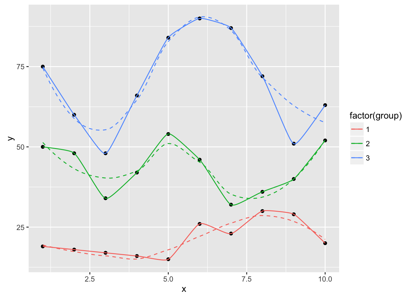
An X-spline is a line drawn relative to control points. For each control point, the line may pass through (interpolate) the control point or it may only approach (approximate) the control point; the behaviour is determined by a shape parameter for each control point.
If the shape parameter is greater than zero, the spline approximates the control points (and is very similar to a cubic B-spline when the shape is 1). If the shape parameter is less than zero, the spline interpolates the control points (and is very similar to a Catmull-Rom spline when the shape is -1). If the shape parameter is 0, the spline forms a sharp corner at that control point.
For open X-splines, the start and end control points must have a shape of 0 (and non-zero values are silently converted to zero).
For open X-splines, by default the start and end control points are replicated before the curve is drawn. A curve is drawn between (interpolating or approximating) the second and third of each set of four control points, so this default behaviour ensures that the resulting curve starts at the first control point you have specified and ends at the last control point. The default behaviour can be turned off via the repEnds argument.
Aesthetics
geom_xspline understands the following aesthetics (required aesthetics
are in bold):
-
x -
y -
alpha -
color -
linetype -
size
Computed variables
x
y
References
Blanc, C. and Schlick, C. (1995), "X-splines : A Spline Model Designed for the End User", in Proceedings of SIGGRAPH 95, pp. 377-386. http://dept-info.labri.fr/~schlick/DOC/sig1.html
See Also
geom_line: Connect observations (x order);
geom_path: Connect observations;
geom_polygon: Filled paths (polygons);
geom_segment: Line segments;
xspline;
grid.xspline
Other xspline implementations: geom_xspline2
Examples
set.seed(1492)
dat <- data.frame(x=c(1:10, 1:10, 1:10),
                  y=c(sample(15:30, 10), 2*sample(15:30, 10),
                      3*sample(15:30, 10)),
                  group=factor(c(rep(1, 10), rep(2, 10), rep(3, 10)))
)

ggplot(dat, aes(x, y, group=group, color=group)) +
  geom_point() +
  geom_line()

ggplot(dat, aes(x, y, group=group, color=factor(group))) +
  geom_point() +
  geom_line() +
  geom_smooth(se=FALSE, linetype="dashed", size=0.5)

ggplot(dat, aes(x, y, group=group, color=factor(group))) +
  geom_point(color="black") +
  geom_smooth(se=FALSE, linetype="dashed", size=0.5) +
  geom_xspline(size=0.5)

ggplot(dat, aes(x, y, group=group, color=factor(group))) +
  geom_point(color="black") +
  geom_smooth(se=FALSE, linetype="dashed", size=0.5) +
  geom_xspline(spline_shape=-0.4, size=0.5)

ggplot(dat, aes(x, y, group=group, color=factor(group))) +
  geom_point(color="black") +
  geom_smooth(se=FALSE, linetype="dashed", size=0.5) +
  geom_xspline(spline_shape=0.4, size=0.5)

ggplot(dat, aes(x, y, group=group, color=factor(group))) +
  geom_point(color="black") +
  geom_smooth(se=FALSE, linetype="dashed", size=0.5) +
  geom_xspline(spline_shape=1, size=0.5)

ggplot(dat, aes(x, y, group=group, color=factor(group))) +
  geom_point(color="black") +
  geom_smooth(se=FALSE, linetype="dashed", size=0.5) +
  geom_xspline(spline_shape=0, size=0.5)

ggplot(dat, aes(x, y, group=group, color=factor(group))) +
  geom_point(color="black") +
  geom_smooth(se=FALSE, linetype="dashed", size=0.5) +
  geom_xspline(spline_shape=-1, size=0.5)
Alternative implemenation for connecting control points/observations with an X-spline
Description
Alternative implemenation for connecting control points/observations with an X-spline
Usage
geom_xspline2(mapping = NULL, data = NULL, stat = "identity",
  position = "identity", na.rm = FALSE, show.legend = NA,
  inherit.aes = TRUE, ...)
Arguments
mapping |
Set of aesthetic mappings created by |
data |
The data to be displayed in this layer. There are three options: If A A |
stat |
Use to override the default connection between
|
position |
Position adjustment, either as a string, or the result of a call to a position adjustment function. |
na.rm |
If |
show.legend |
logical. Should this layer be included in the legends?
|
inherit.aes |
If |
... |
other arguments passed on to |
Value
creates a spline curve
Author(s)
Ben Bolker
See Also
Other xspline implementations: geom_xspline
Load stateface font
Description
Makes the ProPublica StateFace font available to PDF, PostScript, et. al. devices.
Usage
load_stateface()
See Also
Other StateFace operations: geom_stateface,
show_stateface
Plotly helpers
Description
Helper functions to make it easier to automatically create plotly charts
Usage
to_basic.GeomXspline(data, prestats_data, layout, params, p, ...)

to_basic.GeomBkde2d(data, prestats_data, layout, params, p, ...)

to_basic.GeomStateface(data, prestats_data, layout, params, p, ...)
Arguments
data, prestats_data, layout, params, p, ... |
plotly interface parameters |
Show location of StateFace font
Description
Displays the path to the StateFace font. For the font to work in the on-screen plot device for ggplot2, you need to install the font on your system
Usage
show_stateface()
See Also
Other StateFace operations: geom_stateface,
load_stateface
Compute and display a univariate averaged shifted histogram (polynomial kernel)
Description
See bin1 & ash1 for more information.
Usage
stat_ash(mapping = NULL, data = NULL, geom = "area", position = "stack",
  ab = NULL, nbin = 50, m = 5, kopt = c(2, 2), na.rm = FALSE,
  show.legend = NA, inherit.aes = TRUE, ...)
Arguments
mapping |
Set of aesthetic mappings created by |
data |
The data to be displayed in this layer. There are three options: If A A |
geom |
Use to override the default Geom |
position |
Position adjustment, either as a string, or the result of a call to a position adjustment function. |
ab |
half-open interval for bins [a,b). If no value is specified,
the range of x is stretched by |
nbin |
number of bins desired. Default |
m |
integer smoothing parameter; Default |
kopt |
vector of length 2 specifying the kernel, which is proportional to ( 1 - abs(i/m)^kopt(1) )i^kopt(2); (2,2)=biweight (default); (0,0)=uniform; (1,0)=triangle; (2,1)=Epanechnikov; (2,3)=triweight. |
na.rm |
If |
show.legend |
logical. Should this layer be included in the legends?
|
inherit.aes |
If |
... |
other arguments passed on to |
Details
A sample of the output from stat_ash():
Aesthetics
geom_ash understands the following aesthetics (required aesthetics
are in bold):
-
x -
alpha -
color -
fill -
linetype -
size
Computed variables
densityash density estimate
References
David Scott (1992), "Multivariate Density Estimation,"
John Wiley, (chapter 5 in particular).
B. W. Silverman (1986), "Density Estimation for Statistics
and Data Analysis," Chapman & Hall.
Examples
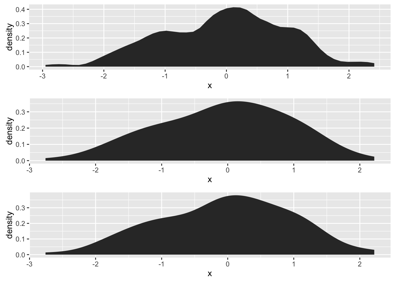
# compare
library(gridExtra)
set.seed(1492)
dat <- data.frame(x=rnorm(100))
grid.arrange(ggplot(dat, aes(x)) + stat_ash(),
             ggplot(dat, aes(x)) + stat_bkde(),
             ggplot(dat, aes(x)) + stat_density(),
             nrow=3)

cols <- RColorBrewer::brewer.pal(3, "Dark2")
ggplot(dat, aes(x)) +
  stat_ash(alpha=1/2, fill=cols[3]) +
  stat_bkde(alpha=1/2, fill=cols[2]) +
  stat_density(alpha=1/2, fill=cols[1]) +
  geom_rug() +
  labs(x=NULL, y="density/estimate") +
  scale_x_continuous(expand=c(0,0)) +
  theme_bw() +
  theme(panel.grid=element_blank()) +
  theme(panel.border=element_blank())
Step ribbon statistic
Description
Provides stairstep values for ribbon plots
Usage
stat_stepribbon(mapping = NULL, data = NULL, geom = "ribbon",
  position = "identity", na.rm = FALSE, show.legend = NA,
  inherit.aes = TRUE, direction = "hv", ...)
Arguments
mapping |
Set of aesthetic mappings created by |
data |
The data to be displayed in this layer. There are three options: If A A |
geom |
which geom to use; defaults to " |
position |
Position adjustment, either as a string, or the result of a call to a position adjustment function. |
na.rm |
If |
show.legend |
logical. Should this layer be included in the legends?
|
inherit.aes |
If |
direction |
|
... |
other arguments passed on to |
References
https://groups.google.com/forum/?fromgroups=#!topic/ggplot2/9cFWHaH1CPs
Examples
x <- 1:10
df <- data.frame(x=x, y=x+10, ymin=x+7, ymax=x+12)

gg <- ggplot(df, aes(x, y))
gg <- gg + geom_ribbon(aes(ymin=ymin, ymax=ymax),
                       stat="stepribbon", fill="#b2b2b2")
gg <- gg + geom_step(color="#2b2b2b")
gg

gg <- ggplot(df, aes(x, y))
gg <- gg + geom_ribbon(aes(ymin=ymin, ymax=ymax),
                       stat="stepribbon", fill="#b2b2b2",
                       direction="hv")
gg <- gg + geom_step(color="#2b2b2b")
gg